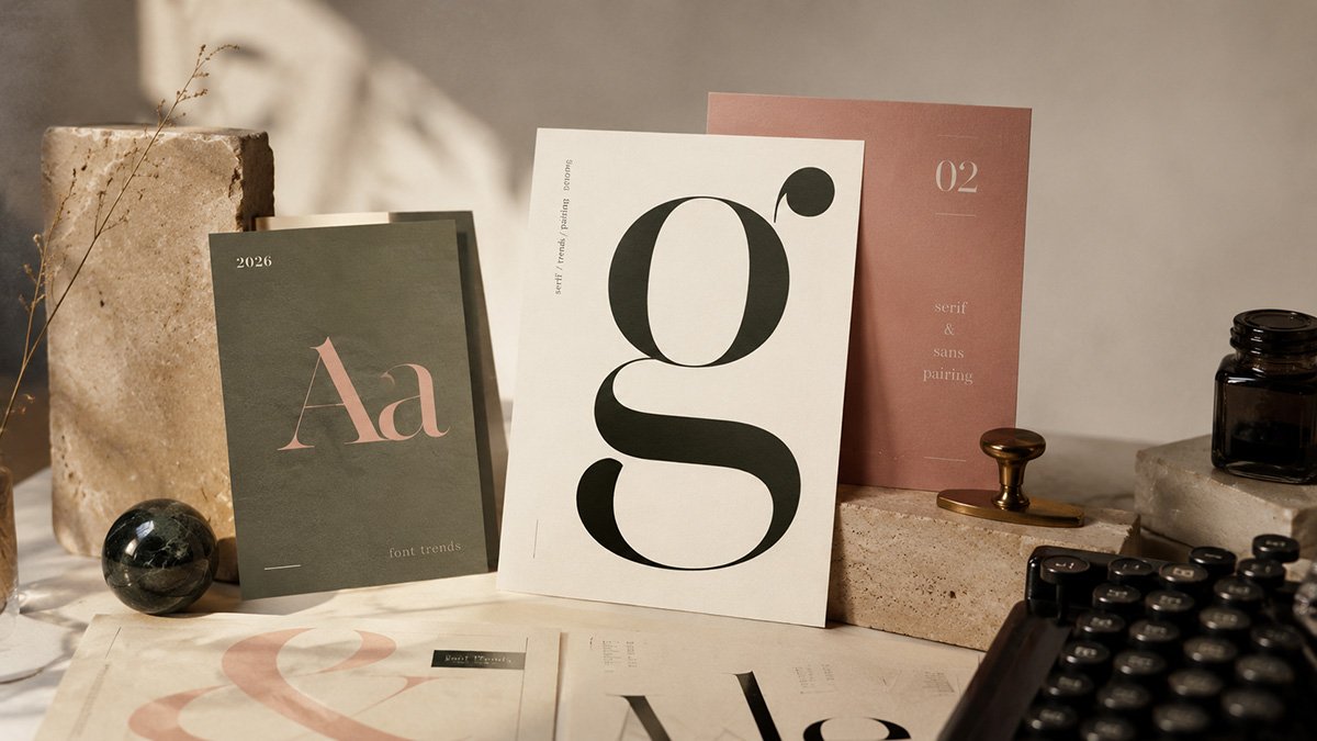
Font Trends 2026: The 10 Fonts We Use
Typography in 2026 is moving away from “neutral by default.” The strongest brand and web work is still clear and readable, but it is also more specific and intentional. The goal is not to chase novelty. The goal is a type system that feels designed on purpose.